
Embracing Diversity Through Inclusive Web Design

We all started our new year with good intentions – mostly on a personal note. To eat healthier, to get more exercise, spend less time in front of our screens. Let’s shift our focus now to our collective wellbeing. There are plenty of small ways to check in on our community – near or far – and contribute in meaningful ways.
This can be as simple as offering a lonesome, elderly neighbor a helping hand with groceries or trips to the doctor; fact-checking and sharing important information in emergency situations, or getting involved in local social initiatives for LGBTQ+ youths or houseless individuals.
Now – more than ever – it is important to embrace diversity in all its beautiful forms. This means that we need to consider the full spectrum of our fellow humans in everything we do – including the way we communicate and present our services online.
What is Inclusive Web Design?
When we speak of inclusive web design, we are referring to formats, layouts and tools that make our website accessible to everyone.
This includes font style and size choices for optimal readability, wording, colors and accessibility widgets such as Userway or accessiBe.
Inclusive website design is not only about taking the target audience into account. It’s about identifying all the information and features on the website that may not be accessible to everyone in the same way and adapting these accordingly.
So, what does that mean? Well, let’s look at our family and friends in terms of user experience. How do your teenage navigate the online world? Chances are they click and swipe through websites and apps so fast, you can hardly keep up.
Whether they are tech-savvy or not, your (grand)parents will have a different approach to taking in and searching for information. Here, the value in readability and clear, concise call-to-actions or click-through features will be rated much higher than movement and imagery.
What about your neurodivergent bestie? Would they get more out of a text-heavy website full of niche-specific jargon or a minimalist design with straightforward and purposeful language?
Inclusive website design ensures that text content and design are accessible to neurodivergent individuals.
With differences in age, neurotypes, cultural backgrounds, etc. there is a lot to consider in terms of how we can make our websites more inclusive, and we are excited to help you take this step alongside you.
Examples of Inclusive Web Design
Recently, we worked on an incredibly interesting and informative project for three US professors of Organizational Performance and Workplace Learning, who published a book on Instructional Design for Organizational Justice. Lisa A. Giacumo, Ph.D – with whom we worked closely to ensure that the website design and layout were inclusive and accessible to everyone – focuses her research on:
“Learning design and technology contexts that span the globe, are cross-cultural, in support of marginalized populations, and integrate technology, digital devices, and both instructional and non-instructional interventions.”
This project included the branding and logo as well as website design, for which we went through a detailed process of color contrasting to ensure optimal color accessibility. These are color combinations with a high enough contrast to ensure layered elements stand out efficiently from their backgrounds, which is especially important for visually impaired individuals.
A good way to ensure this is using contrast checker tools such as WebAIM.
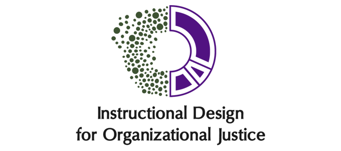
The Instructional Design for Organizational Justice logo adheres to web accessibility guidelines because of:
High Contrast – Dark colors on a light background ensure readability for visually impaired users.
Simple and Clear Font – Clean typography benefits users with dyslexia or cognitive disabilities.
Distinct Colors – Green and purple sections help differentiate elements for color-blind users.
No Overlapping Elements – The logo avoids overlapping details that might be hard to discern.
Scalable Design – Maintains clarity when resized, essential for responsive web design.
Another great example of an inclusive website is the one we created for Libros para Pueblos. This non-profit organization is dedicated to supporting libraries in economically and socially disadvantaged regions of Oaxaca, Mexico, and promoting reading through different programs and events.
As is true for all non-profits, the main focus of the website is on reaching existing and new donors. With the main donor population being around 55+, the website layout and design choices needed to reflect that. Hence, the font used is Libre Baskerville and is sized accordingly, and the text content immediately gives visitors the low-down of what to expect and where to expect it.

Example of a clear, accessible call to action on the Libros para Pueblos website.
These choices also take into consideration individuals with dyslexia, ASD and other neurological differences. With the focus of this wonderful program being on potentially new and non-native readers, this approach also caters to readers at different skill levels, making it accessible and engaging for all.
Oaxaca is a beautiful, culturally and linguistically diverse city that is home to as many as 15 different language groups. While the majority of donors are from English-speaking countries, it was just as important to include local and/or native project members and donors, thus offering the website – in its entirety – in both English and Spanish.
Why Language & Imagery Matters: Taking it Beyond Age & Neurodiversity
One of the things we most enjoy about our work at Sustainable Digital is the fact that we learn something new with every project. Having worked with many psychologists, therapists and non-profits focused on mental health, we have learned a lot about inclusivity and compassion.
This has helped us intuit what may or may not work for website design, especially for websites informing sensitive content. When choosing images for blog posts or pages dedicated to specific mental-health issues or case studies, we are careful to opt for suggestive rather than literal representations thereof.
While working on the website for Still Serving Veterans, their project managers turned our attention to the importance of avoiding certain colors and flashy imagery or video content that could be triggering to their visitors. The impact of PTSD can be easily overlooked by someone with little understanding thereof, but it is something that must be taken into consideration when working on projects like this.
The language we use to engage with potential clients or visitors is another imperative factor in practicing inclusivity. While it goes without saying that the tone should be neutral yet friendly, there is a tendency to overcomplicate mission statements – specifically in the tech, medical and legal worlds – when, typically, there is no need to.
Again, the goal is to speak to everyone – folks who have expert knowledge of the product or services you’re selling and those who want to learn about it. Keep this in mind as you’re writing your website content. Visualize a crowd of people from all over the world: how would you address them in a way that would allow them all to leave the event feeling informed, satisfied, and, most importantly, motivated to want to learn more and/or work with you?
Why Our Collaborative Process Matters
We are excited to share this article with you – and not only as a means to give you ideas for all the ways in which you can embrace diversity through inclusive website design, but also to reiterate, once again, how important our collaborative process is to us and our clients. As you can see from some of the examples we offered above, this is a mutual learning process and appreciation society.
Our clients invite us into their worlds, their industries and their knowledge, and, combined with our expertise in design, branding and SEO-optimized content, we can offer the very best experience for end-users and potential clients.
So, let’s do our part in making the (online) world a better, more inclusive and beautiful place in 2025 – let’s collaborate!