
Vamp Up for the Giving Season: Turn Your Website Visitors into Donors, Volunteers & Advocates

It’s been hard to part with the summer and those carefree vibes it brings, and September’s unseasonably high temperatures haven’t made it any easier.
Yes, we may have frolicked between the waves of foreign seas, taste-tested every new ice-cream flavor at our local parlor and spent quality time quietening our busy adult minds and matching the lightness of our (neighborhood) children and pets playing and lazing in the sun.
That didn’t mean we could completely disconnect from reality, however. How could we? Those scorching temperatures? Happening for a very real, scientifically proven reason. Women, people of color and LGBTQ people fearing for their lives? The terror is tangible.
Now that we’re entering the Giving Season, we’ve been thinking about how we can best support nonprofit organizations as they turn that awareness into action. Because, yes, everything is political.
Here are our top tips on how to prepare your website for the Giving Season so you can get the support your cause deserves.

The Autumn Reset: Remove the Noise, Refocus on Clarity
Where we live, we are currently in that annoying limbo between summer and the very slooow beginnings of autumn – and our wardrobes reflect this. They are still full of bright colors and flowery patterns that distract from the cozier, clear vibes of some of the fall clothes squeezed somewhere into the middle.
During the course of the year, this can happen to our website’s layout and content too, particularly on the homepage. We add new tweaks in the spring, overload our event calendar in the summer, forget about that pop-up still announcing a mid-season launch and before you know it, there’s too much noise and barely any room to take it all in.
According to an article published on Forbes Councils, people are exposed to between 6,000 and 10,000 advertisements a day. Make sure your homepage or donation page won’t overwhelm already overwhelmed brains.
Instead, say goodbye to – insignificant or redundant – past seasonal content and hello to the fall (seasonal, not the fall of society). Embrace this idea of encouraging reflection by focusing on clarity: in your website’s design, messaging and content.
Make it stand out by:
Establishing Clear Hierarchy Through Size, Spacing & Contrast
Had I organized our wardrobes by color or item, we wouldn’t find ourselves reaching for the same garments every week for no other reason than a serious case of decision fatigue.
Don’t make the same mistake by tiring out potential advocates, donors or volunteers: make the next step clear and give them a reason to take it.
Here, the layout is key. There’s no need to add fancy design elements or animation to grab a user’s attention; on the contrary. By sticking to a simple but effective layout strategy, you can create content hierarchy – i.e. clear emphasis on what’s important in a manner that’s easily digestible for even the most tired brain.
You can achieve this by design choices such as adding more weight to specific headers by using bold fonts and customized sizing or following a well-thought-out color palette that marks a clear division between different categories – just remember not to go overboard: keep the palette focused and use colors consistently, following your branding guidelines where available.
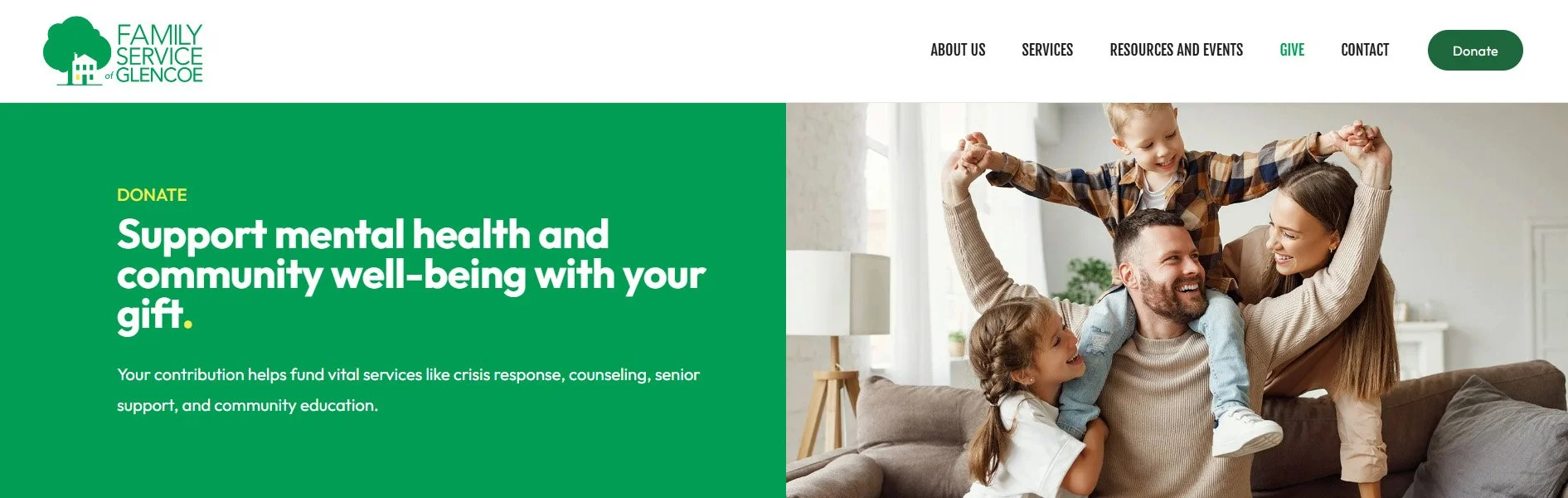
Most importantly, you’ll want to rely on a lot of white space around your CTAs. Think of it like white noise – the kind you turn to for a focused work session or to drown out your monkey-mind when you’re trying to get to sleep at night. White space offers a similar kind of breathing room, allowing the viewer to absorb the message without distraction.
Don’t Hide Your Ask: Call to Action from the Get-Go
If you’re subscribed to our newsletter, you will have read all about this month’s client highlight, The Civics Center. If you haven't, here's your chance to do so now: hit the subscribe button below this post or check out our blog right here. See what I did there?
Before going any deeper into this paragraph, I pointed out exactly what I wanted from you, dear website visitor. And for an organization like The Civics Center, whose work helps young people register to vote and participate in elections, that same directness matters. Skip the niceties – this is what we want you to do. Everything else can wait.
Take a look at their homepage set-up below: in the navigation menu, you’ve got the two main asks highlighted in two different colors that form part of their branding. REGISTER TO VOTE in teal, DONATE (including a drop down of the different ways to give) in red. Right below that, in the hero banner, you’ve got your first CTAs that act as button links to all the information needed to jump into action: Learn More and Run a Drive.
These links serve different purposes: the navigation keeps registration and donations easy to find, while the hero buttons introduce the campaign and how to take part. The point isn’t to give every action equal weight, but to make each route easy to recognize.
So, technically – and though it might sting a little for those who spend a lot of time writing original content for their websites – visitors can skip everything else on the homepage or even the website in general, and get to where they need to be quickly and efficiently.
Make Your Online Donation Forms Work for You
It goes without saying that nonprofit organizations need an easy, reliable and trustworthy online donation platform such as Givebutter or Bloomerang, but how you use it is key to getting those donations coming in.
When you’re looking at online fundraising software, there are several things you should take into account to make giving straightforward and help donors understand the difference their contribution can make. These include:
Customizable Donation Amounts: Offer a small selection of suggested amounts suited to your fundraising goals, along with a write-in field so donors can choose their own contribution.
Mobile Adaptability: As with any other online content, donation forms or boxes should be fully mobile responsive, thus allowing potential donors to contribute from wherever they are, in the moment.
Customizable Descriptions: Add descriptions that are personal to your organization, and give donors a clear idea of how exactly their donation will be put to use.
Take a look at the donation page of our long-term client, Still Serving Veterans, for example. The ask is clear, there are five tiers to choose from – one-time and monthly – along with a write-in and dedication option.
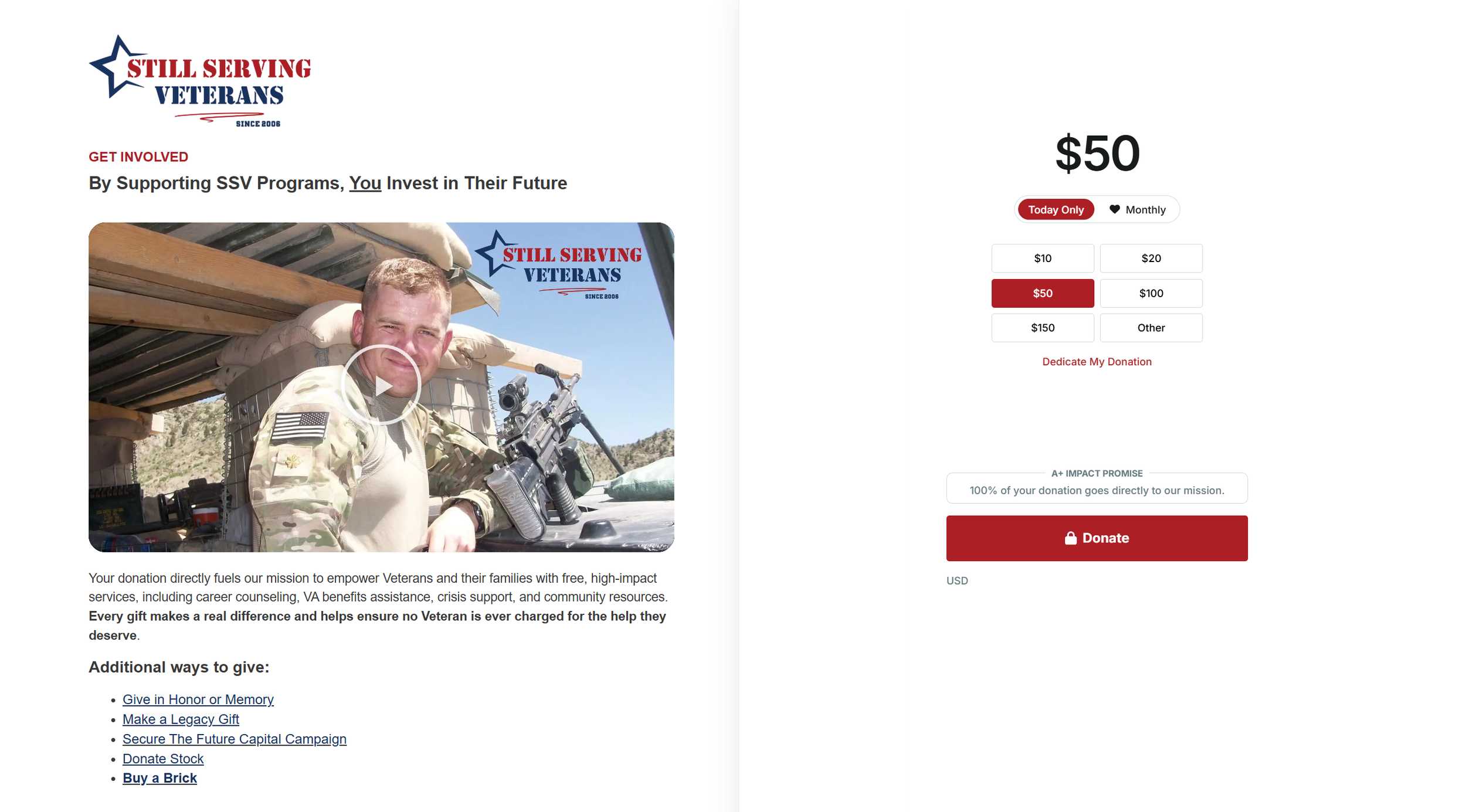
Next to that, Still Serving Veterans offers a list of “Additional Ways to Give”, including legacy gifts, stock donations and their “Secure the Future Capital Campaign”. This campaign is focused on securing a new facility with improved accessibility for Veterans with mobility challenges and quiet, private spaces for VA-accredited counseling sessions – the full information of which is offered on a dedicated page linked directly from the donation page.
As with your overall website layout, the rule of thumb - especially during crucial campaign moments - is less is more.
You want the messaging around the donation form to be clear and to the point in order to support rather than distract from the ask.
And, just as on the homepage where you’ll want the Donate buttons and CTAs front and center, make the next step immediately clear on your donation or campaign page too. If the form sits further down the page, provide a prominent button that takes visitors straight to it.

Give Visitors the Tools to Take Action
Make sure your CTAs lead your visitors – i.e. potential volunteers, advocates or donors – not just to the information they need to learn more about your cause, but also the resources to actively involve them or get them started. For your organization, this might look like an easy way to register for an event or to sign up as a volunteer.
For nonprofit organizations such as The Civics Center, this can look like downloadable toolkits for educators that include data and ready-to-use lessons to engage students and inspire them to make an impact. But it can be something as “small” as adding a share widget to important blog posts or social media campaign pages.
Again, people are bombarded with so much news and so many posts and initiatives that you need to be sure you can keep their attention on you. Visitors landing on your page may already be motivated to help, but without a clear way to do so, you could end up in their “saved for later” folder. Make it easy to act while that motivation is there!
Make it Personal with Real Storytelling and Images
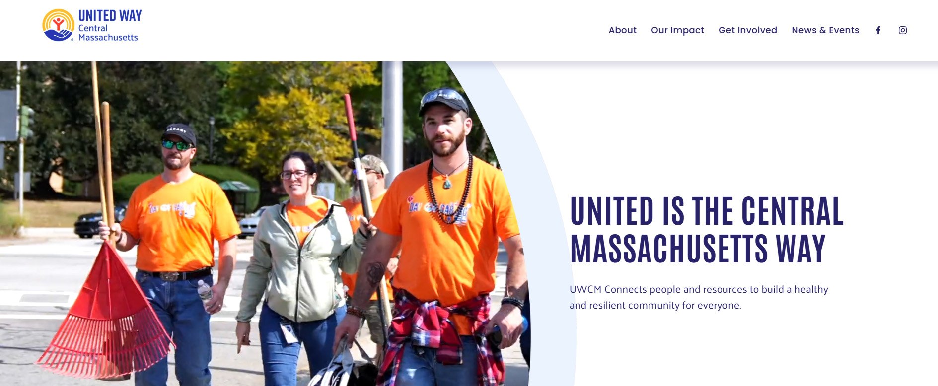
In order to get your website visitors truly invested in your organization, you need to get personal, sooner rather than later. Give them a good sense of who you are, what you do and who your work supports right off the bat.
Let them know that your story goes beyond the hero banner’s tagline and you’re happy to share it: the origins, the inspiration, the team behind your campaigns and the difference your work makes. People want to know you and understand who their support will help. They want to hear your voice when they’re reading about what matters to you, and feel the sincerity behind your motivation.
Be sure to provide these stories, in your own words. There’s no need to go overboard with unsustainable blogging goals. Instead, go with what comes naturally to you, and if it doesn’t, revert to the art of short social media posts to gradually build a bigger story, and focus on original imagery instead.
You don’t need to be a pro to take quality pictures that tell a story, and you don’t always have to include faces if that’s something you’re not comfortable with. How about that staff member with the killer manicure and interesting tattoos? Train your lens on their hands working on folding flyers or dancing over the keyboard to announce your next event or publication. Attending a protest as an organization? Get a team picture from the back, showing off your swag.
Right now, it’s more vital than ever to make an effort where original content is concerned.
Don’t risk being buried under cookie-cutter texts and images when you can stand out with authenticity and emotion.
Let Us Help You Get into Giving Mode
With the Giving Season upon us, don’t let the opportunity pass by to give your website a little TLC and help more visitors take action.
If you would like us to review your website and offer customized advice or tailor a revamp package specifically to your needs, get in touch. Let’s make an impact this Giving Season!