
Web Design &
Development.
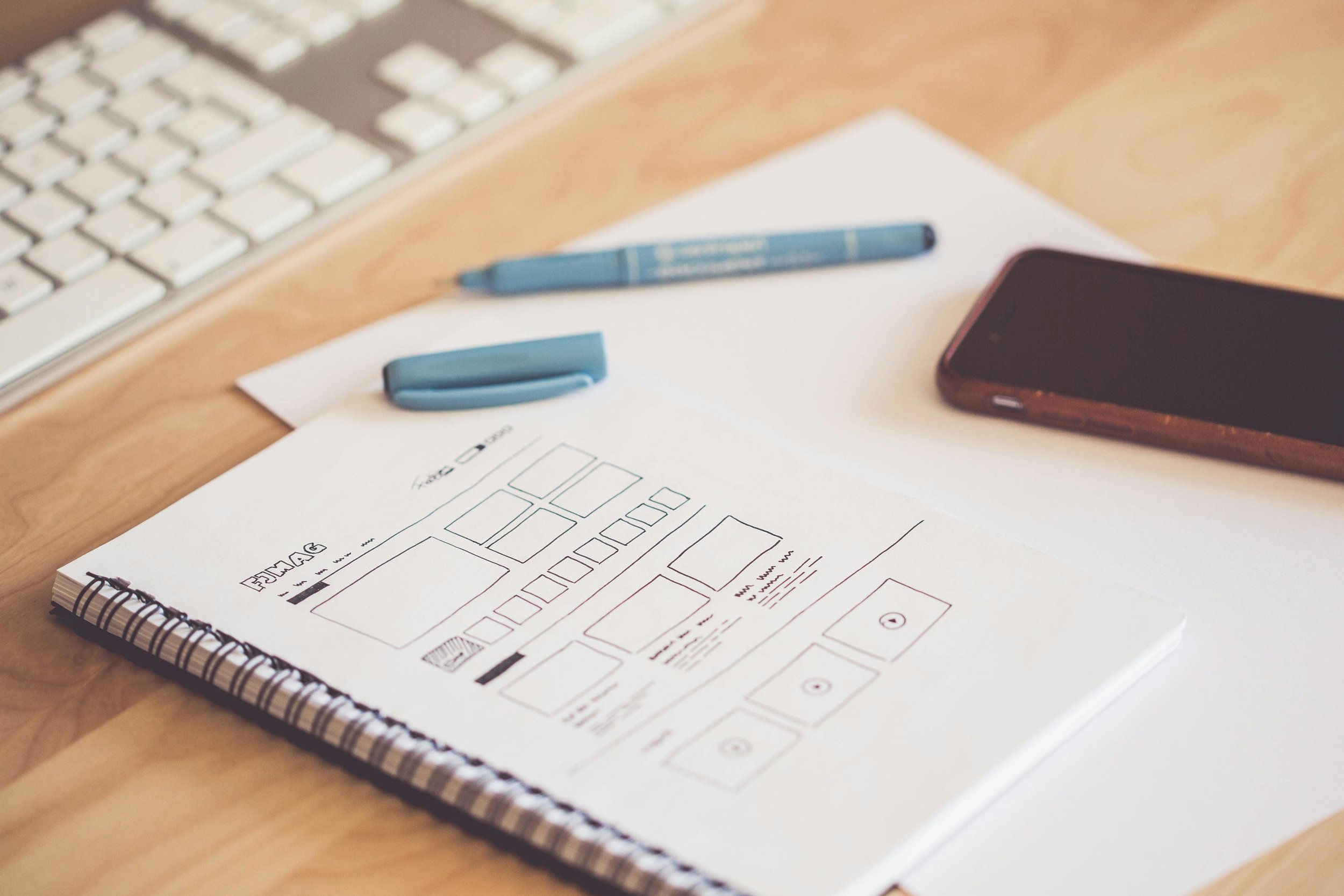
Let us help you design and develop an attractive website that is easy for your organization to maintain – built to appeal to both users and search engines.


CREATING AN ONLINE IMPACT
Perfect Functionality for Your Purposes
It’s vital for your organization to create an online impact. We support your mission with the best approach, tools and creative skills needed to design and build a website that brings together your visual brand and proposition. Using Squarespace as our main platform, we ensure the perfect functionality for your purposes and site optimization for online ranking.
Our goal is to elevate your company/organization’s messaging with a fitting design that reflects your brand values with a site that sits at the heart of your digital marketing efforts.

FLEXIBILITY, MAINTENANCE & MANAGEABILITY
Why We Love Squarespace
The advantages to using Squarespace as the platform from which to build your website are plentiful, but for us, it comes down to three key aspects:
Flexibility in terms of design, plugins and customization using a vast variety of existing templates or CSS coding
Easy maintenance using simple and intuitive built-in tools that allow you to keep your content and design elements fresh and up to date, without having to rely on cumbersome plugin updates or worry about backups.
Manageability by having everything in one place: your website and domain hosting, your website, blog, e-shop and newsletter functionalities.
We believe in a collaborative approach to our website design and website development services, one that puts our individual strengths to best use: your ideas and understanding of your brand and messaging, our expertise in translating these both visually and virtually.
Squarespace allows us to do this in a manner that is sensitive to your needs and wishes, ensuring easy maintenance of your website once it is in your hands.
Our Process.
The Kick-Off Call
To get the project rolling, we will set up a kick-off call on Zoom – a meet-and-greet designed to discuss your expectations and our approach.

The Site Structure
Once we decide on the site structure together you will have the chance to workshop your website’s text and media content using our template.

The Design Direction
Upon receiving the content material from you, we will start building the Homepage and one interior page to establish the desired design direction.

The Website Build
Once the design direction has been approved by you, we will start building out the rest of the interior pages based on your initial feedback.

The Finetuning
You will be sent access to your new website along with a spreadsheet on which to list your feedback and any desired changes.

The Launch
Upon completion of the website, it will be adapted for all mobile devices. We will schedule a training session for all matters of maintenance.


A WEBSITE THAT WORKS ON MOBILE, TABLET & DESKTOP
Responsive Web Development
We recognize the importance of your website not only looking attractive but working efficiently across all devices. The office desktop is no longer the main portal from which potential clients/stakeholders will visit your website – and that’s great! We want them to be able to access important information, videos and infographics whenever, wherever and, most importantly, however it is most convenient to them – be it via tablet while on the plane or on the phone whilst lounging around on the couch on a Sunday evening.
To ensure easy navigation, an attractive layout and perfect adaptation across all devices, all our web design and development services are focused on a responsive and sustainable model.
What does that mean? It’s simple: regardless of which device your audience is logging on from, they will be met with a smooth user-experience and an eye-catching design that corresponds with the respective screen size and orientation. All our websites undergo final responsiveness checks prior to launching to ensure optimal user-friendliness and a sustainable setup that can easily be adjusted and maintained as needed.